Transactional emails today play a crucial role in growing engagement and long-term relationships with customers. According to many statistics, transactional emails have open rates of 40%-50% and click rates of around 10%-20%.
Yet not many people know the importance of these emails and how to design them the right way. If you are one of them and looking for ways to carry out great transactional email designs, this article will cater to your needs.
Here we will show you various tips and examples to improve transactional email designs and enhance their impact on target audiences. Before that, we’ll cover some basic questions. Ready to go? Let’s begin.
What are Transactional Emails?
Transactional emails are automated emails triggered in response to specific user actions. For example, account creation, request for changing passwords, completing a purchase, subscribing to newsletters, and more.
The main objective of these emails is to provide users with factual and straightforward messages relevant to their requests and queries. Unlike marketing emails, transactional emails don’t need permission from recipients.
If a user hit some triggers (subscribed to a newsletter, asked for a password reset, got a product delivered, etc), he/she will get the needful transactional email.
Types of Transactional Emails

Based on use cases, we can see many different types of transactional emails online. Among them, we’ll present to you some most popular ones below.
1. Welcome/Registration Emails
Whenever someone creates an account on a new platform, he receives a welcome email. It includes a confirmation message that his account has been created successfully. Good welcome emails can create a positive impression among users.
2. Password Reset Emails
Forgetting passwords is a common occurrence among online users. The password reset email includes a link or a temporary code by which users can set a new password to re-establish their access to their account again.
3. Purchase/Order Confirmation Emails
This purchase/order confirmation email ensures customers that their orders have been received successfully. In the email, you may include a possible delivery date, courier name, order tracking code, and relevant product links.
4. Order Cancellation Emails
Due to the change of mind, wrong product selection, and long delivery time, many customers may want to cancel their orders. Order cancellation emails confirm the requests for canceling customers’ orders have been accepted.
5. Notification Emails
There is a variety of notification emails. Some most popular of them are event reminders, abandoned cart emails, products running out of stock emails, wishlist products arrived emails, new campaign emails, and more.
Why Transactional Emails are so Important

Transactional emails not only pass factual information. They also help brands, businesses, and websites retain their customers by creating a sense of trust, reliability, and security. Let’s explore several key points of why transactional emails are so important.
1. Identify High-Quality Leads
You can include the double opt-in step in the welcome email. It’s the process of sending a verification link that asks users to verify they have created the account with a valid email address. It reduces the risk of spam traps and helps businesses identify high-quality leads.
2. Build Customer Trust
Transactional emails often carry important and confidential information like bills, invoices, temporary passwords, activation links, promo codes, etc. Sharing this information through emails makes users feel valued and builds trust.
3. Increase Engagement and Reactivation
Many users lose interest in particular platforms even after registering there. Based on this behavior, transactional emails can be triggered with amazing offers to reactive these sleeping users. This can boost engagement a lot as well.

4. Grow Brand Recognition
Transactional emails have a high open rate, so you can capitalize on them to grow your brand visibility. You can include your brand logo, core values, and unique selling points at the footer of each email. It will boost brand recognition and benefit you in return.
5. Cross-Selling and Up-Selling
While sending order confirmation and product emails, you can include links and photos of some related products customers may be interested in. This can be a way for you to amplify cross-sell and up-sell.
10+ Tips on How to Improve Transactional Email Design
Great transactional email designs can convey professionalism and trustworthiness. It can make a significant difference in how customers will perceive your brand and interact with it. Explore the tips that can take your transactional email design to the next level.
1. Keep the Design Simple and Clear
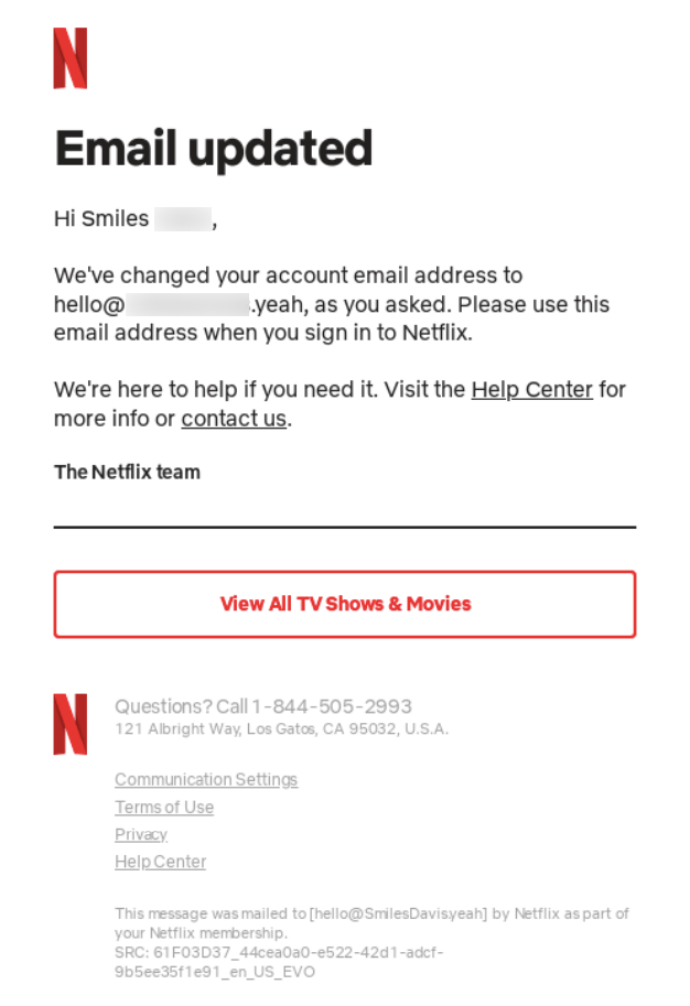
If you look at some top-notch and good-performing emails, you’ll see they uphold simplicity and cleanliness in their designs. Because it creates an environment where readers can retain their focus on the main message, not being distracted by additional elements.
But remember, simplicity doesn’t mean mediocracy. It refers to the idea of minimalism. Yet many users have a misconception about it. In the following ways, you can uphold simplicity and cleanliness in your transactional email design.
- Avoid using multiple fonts (a maximum of two fonts is better).
- Don’t use eye-screaming color pallets.
- Use bullet points or short paragraphs to increase readability.
- Implement a consistent layout throughout the design.
- Add images only if they add value.
- Make a balance between content and whitespace.
Below is a transactional email design example from Netfilx. You can take it as an inspiration to learn about simplicity and cleanliness.
2. Highlight Key Information
According to a recent survey (2022), Litmus found that 30% of all emails today are viewed in less than two seconds, 41% are viewed between two and eight seconds, and 29% are viewed for over eight seconds.
Recipients love spending more time on emails that instantly grab their attention. This is why highlighting key information is important in any email copy, whether it’s headlines, subheaders, CTAs, or descriptions. Look at some best practices of how to do it properly.
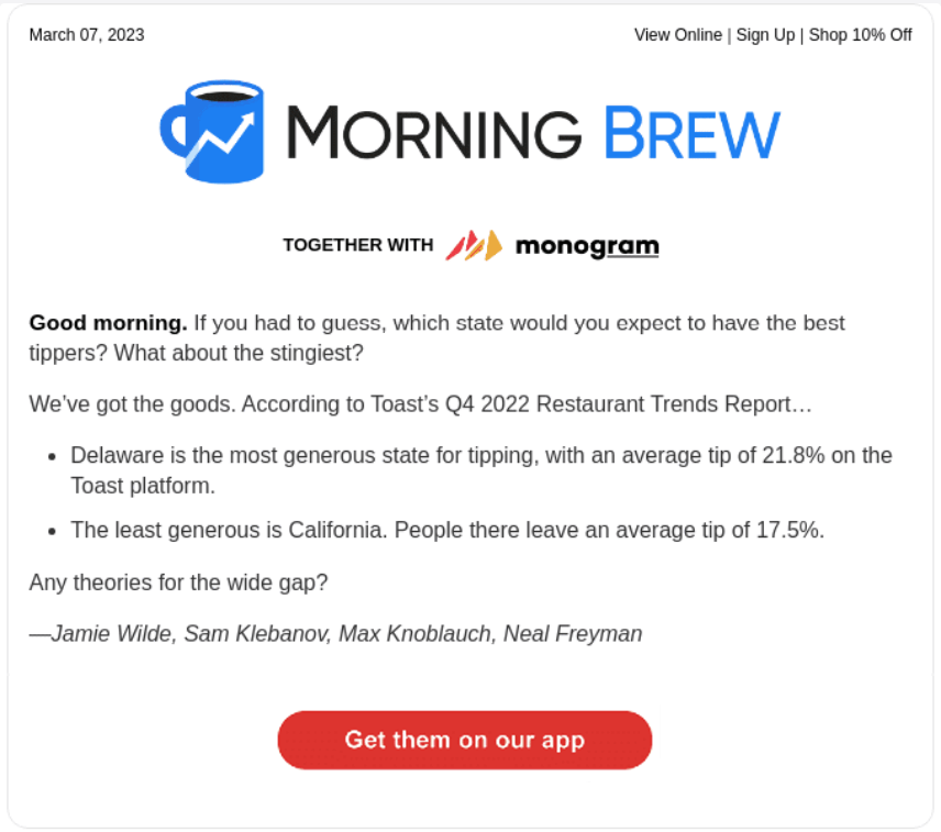
- Follow a hierarchy in which the most important info will come on top.
- Bold, italicize, or underline texts to grab attention.
- Use a larger font or different color to stand out the heading and sub-heading.
- Break down information by bullet points.
- Add visually appealing icons in place of bullet points.
- Apply catchy brand color on the CTA button.
Morning Brew is a media company that circulates business news through newsletters and other ways. You can take inspiration from their newsletter on how to highlight key information following the approaches we have listed above.
3. Use a Responsive Design
According to Campaign Monitor, around 81% of all emails, today are opened and read on mobile phones. Unless your transaction emails are responsive, mobile phone users will fail to view them. And it will be a great loss for your business.
You can create mobile-responsive email templates using HTML templates. But if you are a no-code user, you must use an email marketing plugin. weMail is such a plugin you can use for this purpose. It comes with tons of mobile-responsive templates.
You’ll also get a drag-and-drop template builder by which you can design unique email templates in no time. You’ll get an option on the top by which you can switch templates into different views and make them mobile-responsive.
4. Maintain Brand Consistency
Brand consistency is the process of maintaining a harmonious layout, including the same brand elements in all emails. It helps to build brand recognition with email recipients. Consider the following approaches to create brand consistency in email design.
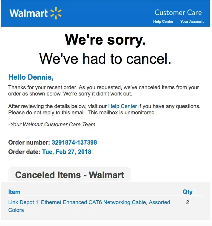
- Add your brand logo, color, fonts, and relevant image(s).
- Use a consistent layout with a header, footer, and CTA buttons of the same color.
- Maintain a fixed schedule for sending emails so recipients don’t miss them.
- Continue the same tone of voice in all emails that reflect your personality.
- Test and update your email designs regularly based on changing recipients’ tastes.
Walmart maintains the same header in all emails triggered from the customer care center. They use the blue color code (0071CE) to highlight the key information. Plus, you’ll notice they write their copies in a friendly-official tone.
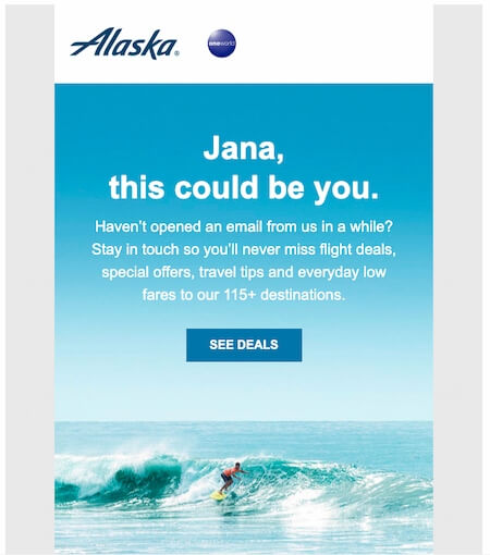
5. Add Personalization
Transactional emails tend to be straightforward. Because they are triggered automatically based on pre-defined programs. So, adding a touch of personalization is quite difficult. But there is no problem if you add a touch of personalization based on user interests and behaviors.
The following approaches can help you personalize your transactional emails.
- Add your recipients’ names, a valid subject line, and a warm greeting.
- Include the order number, courier name, shipping time, and product details.
- Segment the email list based on age, location, and gender to curate the right words.
- Display images of the product they have purchased.
- Ask for product reviews in exchange for a promo code or discount.
6. Avoid Unnecessary Jargon
In every language, you’ll find some jargons that common people don’t know about. If you add such words to messages, it will be difficult for readers and recipients to figure out their meaning. In this case, most users will abandon reading that email.
This is why the best email copies are always very simple and hook readers to the main points. So, how to avoid unnecessary jargon and make your texts easy to read. Look at the points below.
- Know your audiences first.
- Focus on benefits, not on features of the products.
- Use a storytelling technique for creating a narrative to engage users.
- Ensure the average class people can read your messages.
- Give multiple revisions before sending the copy.
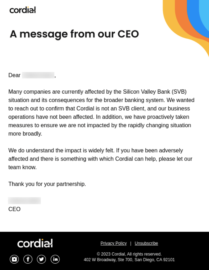
Cordial is cross-channel marketing that helps brands grow an engaging relationship with customers. It sends personalized emails, newsletters, and SMSs to customers on behalf of its client brands. You can take its email as an inspiration to curate copy in a simple and easily understandable language.
7. Add a Clear CTA Button
The CTA button is a must-have element on email templates. Because they increase click-through rates and guide users on what the next step will be. There’re some best practices you must consider while adding the CTA button to your transactional email.
- Know the purpose of your CTA button.
- Curate the CTA copy accordingly (like bye now, add to cart, check now, get promo code, etc.)
- Use the brand color code on the button.
- Make it mobile responsive.
- Avoid adding too many CTA buttons.
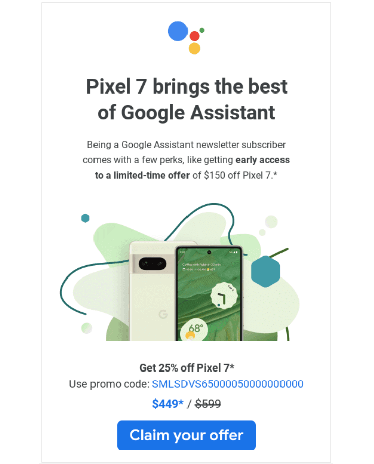
Most eCommerce websites include a CTA button in each transactional email. Software and service-based companies also follow this approach. If you fall into any of these businesses, you can’t avoid including it.
8. Upsell and Cross-Sell Carefully
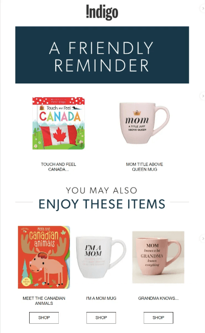
As we already said at the beginning, transactional emails aren’t like traditional marketing emails. So, you naturally have fewer opportunities to promote your products here. But you still can upsell and cross-sell following several tactics.
- List those transactional emails you can use to upsell and cross-sell (like order confirmation, order delivery, add-to-cart, add-to-wishlist, etc.)
- Display product images and links based on user interest and online activity.
- Offer your most reviewed and sold products through emails.
- Send these emails when the open rate is high.
You may include upsell and cross-sell products on the order confirmation, order delivery, product review, cart reminder, and wishlist product reminder emails. Make sure they are related or complimentary to the first product.
9. Test and Optimize Before Sending
Before running any email automation or campaign, you must test out to check if your transactional emails have been perfectly designed. Most well-known organizations around the world do it. Because a single mistake can hurt their brand image.
You can test and optimize your transactional email designs in the following ways.
- Create multiple versions of your templates and check which one performs better.
- Experiment with different subject lines, headers, footers, CTA buttons, and color codes.
- Check how it works on different device screen sizes.
- Get your email copies read by several other team members to check readability.
10. Ask for Reviews and Feedback
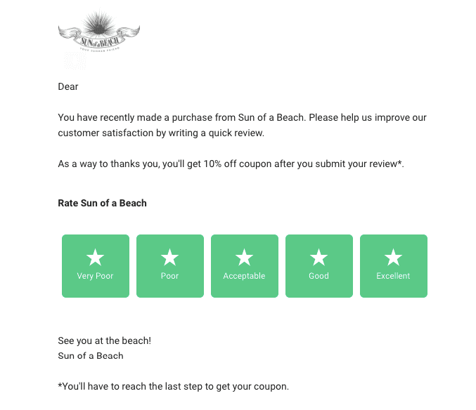
Transactional emails are great for asking for reviews and feedback, as they are sent to customers immediately after they buy a product. Besides, your humble request for a review may feel customers honored, stimulating them to leave feedback.
Check out a list of points you must take into account while designing your transaction emails for reviews and feedback.
- Use customers’ names and personalize the email based on their recent purchases.
- Add a link to the review section of the product they purchased.
- Request for review and feedback clearly and concisely.
- Offer incentives like promo codes or discounts.
- Display the official logo, color, and other brand elements.
Make the review/rating section clearly visible that triggers recipients to review your product. If possible, allow users to complete the review from your email template without causing them to visit a new page. It will boost user experience.
Send Your Transactional Emails with InboxWP to Ensure High Delivery Rate

InboxWP is a plugin designed to simplify the delivery of transaction emails from WordPress websites. It mainly focuses on ensuring 99.5% of high delivery rates and minimizing the risk of emails ending up in the spam folders.
So, if you need to send lots of transactional emails regularly, you can do it safely using the InboxWP plugin. It works with various plugins that send transactional emails, like WooCommerce, Easy Digital Downloads, and membership plugins.
The InboxWP plugin is managed by the same team behind the development of popular plugins, like Dokan, WPERP, WPUF, Appsero, and FlyWP. You’ll get 24/7 professional support from us in case of any need.
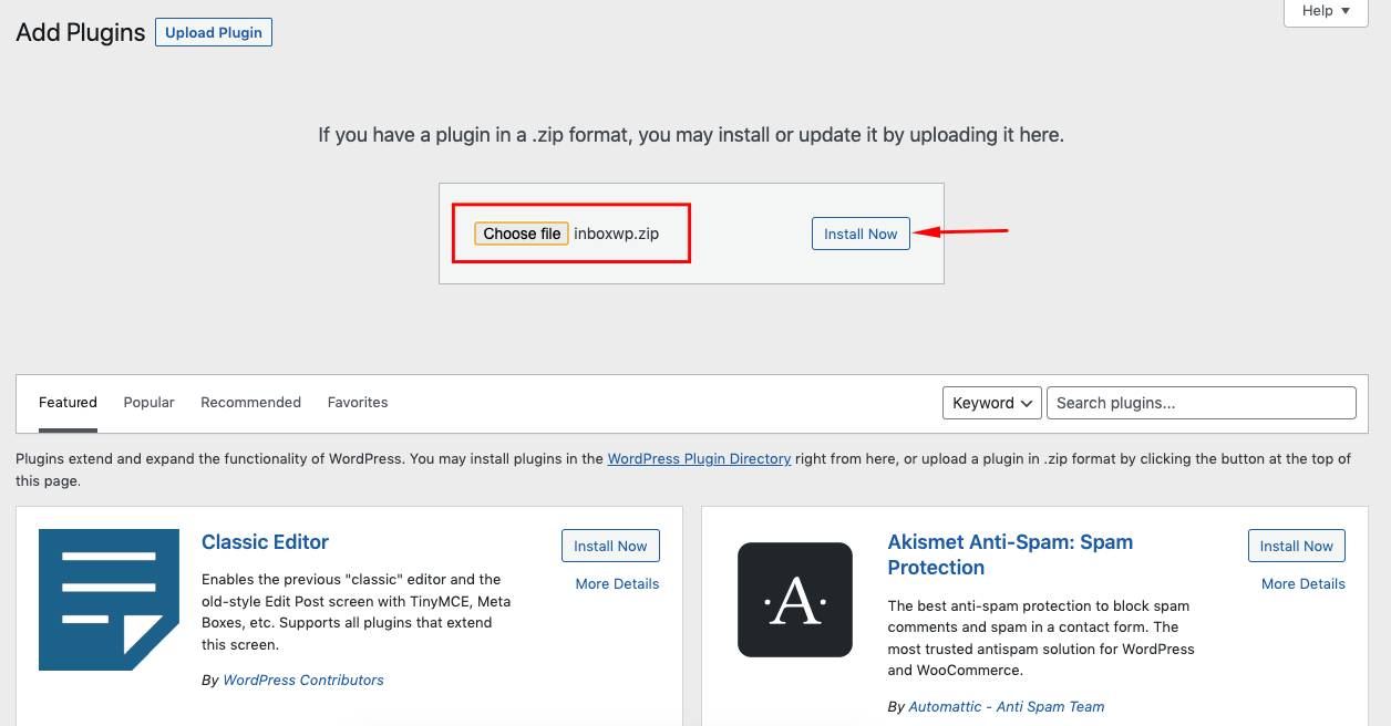
Integrating the plugin on your site is very easy. First, get the InboxWP plugin. Once you have got and downloaded it, upload the plugin to the backend. Then, install and activate it.
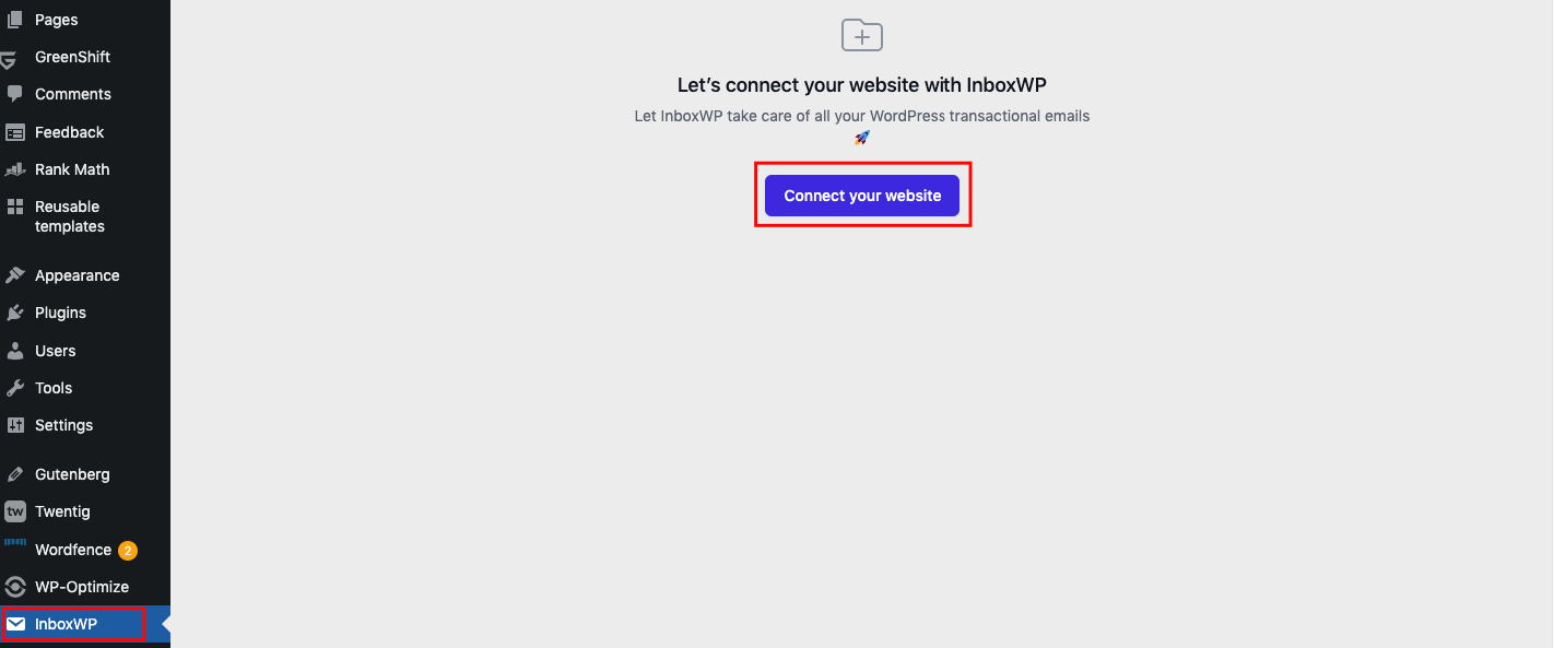
After the plugin is installed, you will see it on the admin bar on your WordPress dashboard. You’ll get an option to connect it to your website. You might be asked to complete several steps. But no worries! These steps are so easy to finish.
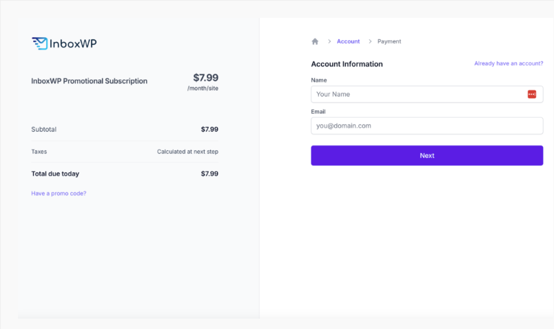
Once the plugin is connected to your site, you’ll be redirected to the subscription page. Get a subscription package and complete the checkout.
After the checkout is over, you’ll land on the main dashboard of the plugin. From here, you can monitor the overall performance of how your transactional emails are hitting user inboxes.
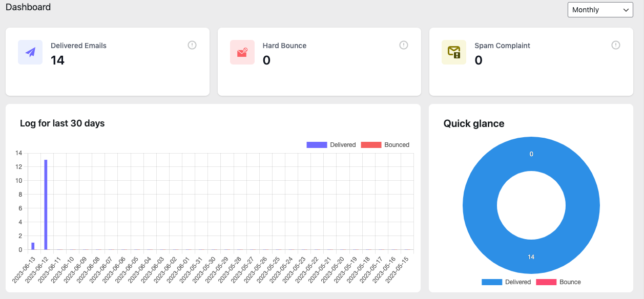
To know how to use the plugin, its features, and make the best use of the plugin, visit the documentation page of the InboxWP plugin.
FAQ on How to Improve Transactional Email Design

What are the standard conversion rates from transactional emails?
The standard conversion varies between the types of transactional emails. But on average, transactional emails have open rates of 40%-50% and click rates around 10%-20%.
What are the legal requirements for transactional email?
Transactional emails are normally sent to your registered and subscribed users. So, you don’t need consent to send them transactional emails. But don’t try to exploit this advantage by sending too many emails, which may cause think you are a spammer.
What are the common mistakes in transactional email design?
- Not having a clear message and infusing it with too many words.
- Adding heavy-duty graphics that distract readers.
- Failing to highlight the key information and make it quickly identifiable.
- Not configuring the automation well (it may cause sending wrong emails to the users).
Should I include social media buttons in transactional emails?
Yes, you should include social media buttons in your transactional emails. It will add value and help you grow followers on your social media platforms.
Should transactional email design include an unsubscribe link?
Since transactional emails don’t fall into the regulation of the CAN-SPAM act, you aren’t obliged to include an unsubscribe link in the design. But our recommendation is you include an unsubscribe link.
Because after a certain period, some users may lose interest in your services. They may avoid opening your emails. It will increase your email bounce rate. Having an unsubscribe link will allow them to leave your list and save you from bounce rates.
Final Takeaway About the Transactional Email Design!
Transactional emails may seem like a straightforward way of communication. But with customization and improvised design approaches, you can make transactional emails appealing like marketing emails. It may open us sales opportunity for you.
You can consistently build brand impressions with your audiences and stimulate them to engage more with products, services, and websites. We have tried our best to cover a detailed guide on how you to improve your transactional email design. If you have more questions, let us know in the comments section below.
